who we are what we do branding impact learn talk to us »

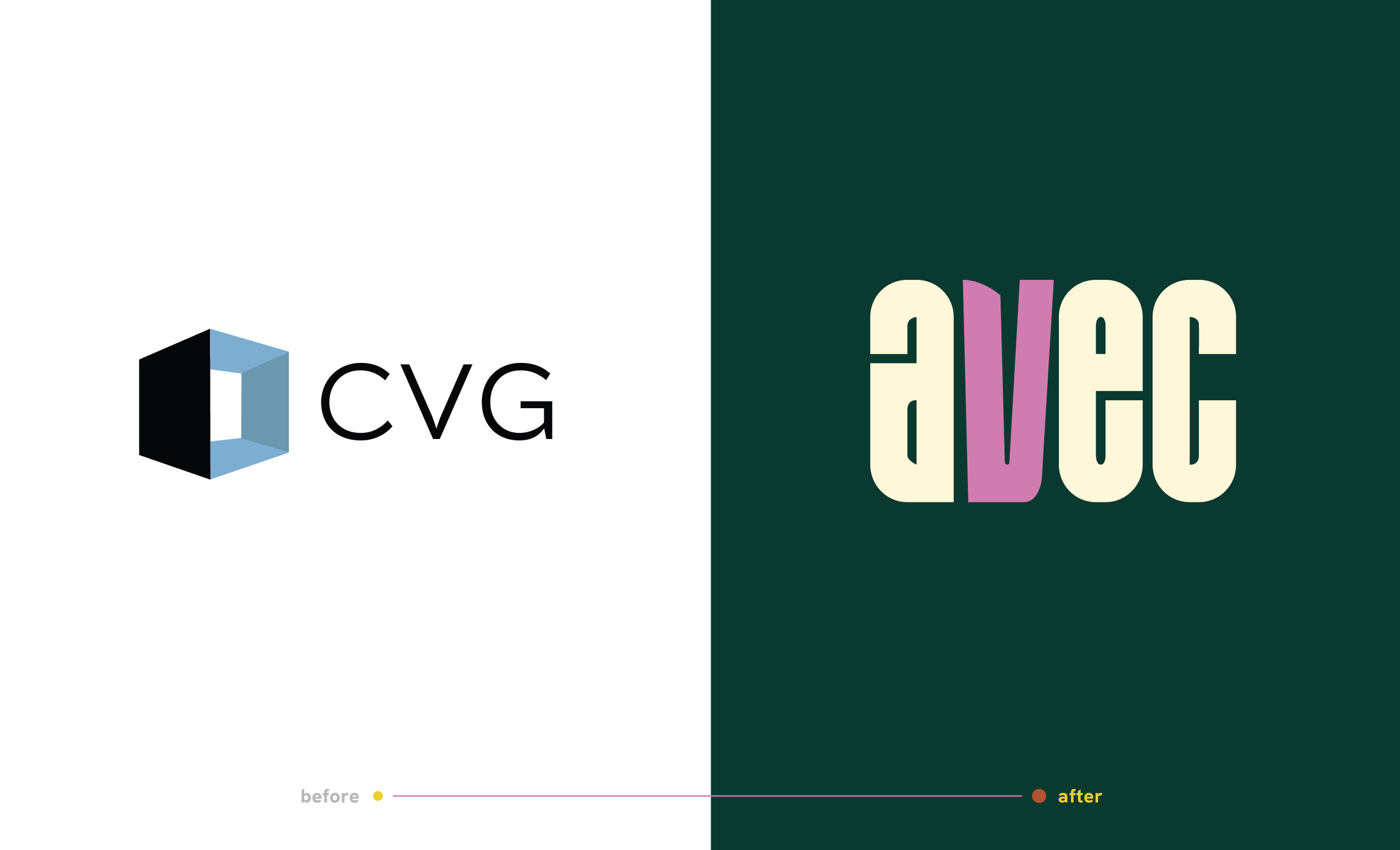
AVEC’s rebrand began with a focused question: how do we reflect who we truly are—deeply knowledgeable, highly practical, and easy to work with? The answer was not a visual refresh alone. It was a disciplined articulation of voice.
Naming
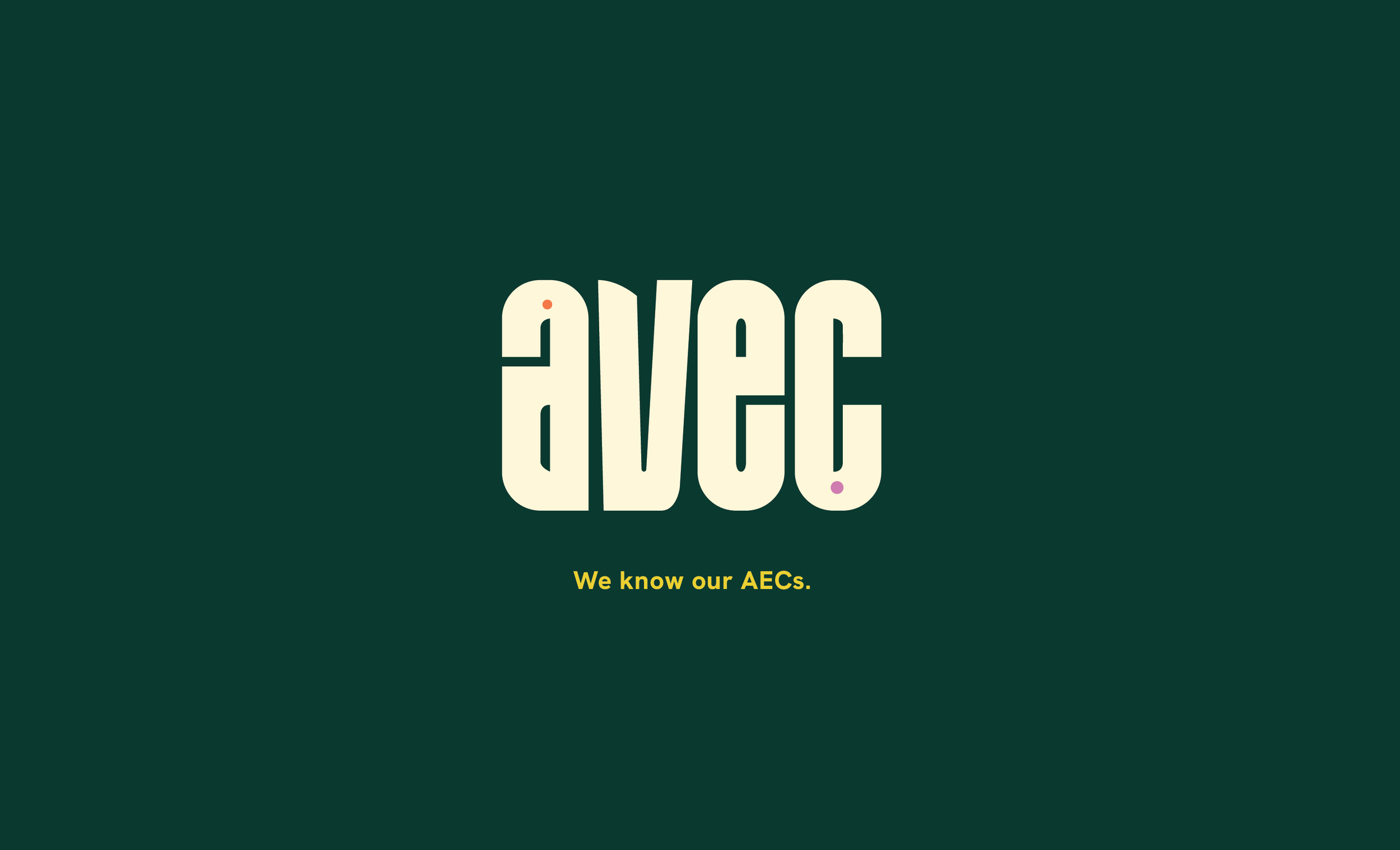
AVEC means “with” in French. The hidden-in-plain-sight “AEC” represents our passion for the clients we serve, while the “V” is a serendipitous nod to our beginnings as Charrette Venture Group.
AVEC communicates…we’re in this with you. We’re on your team. We’ve got your back. It articulates our highest goal—to alleviate stress, anxiety, and uncertainty in the lives of firm leadership.
A brand with energy at its core
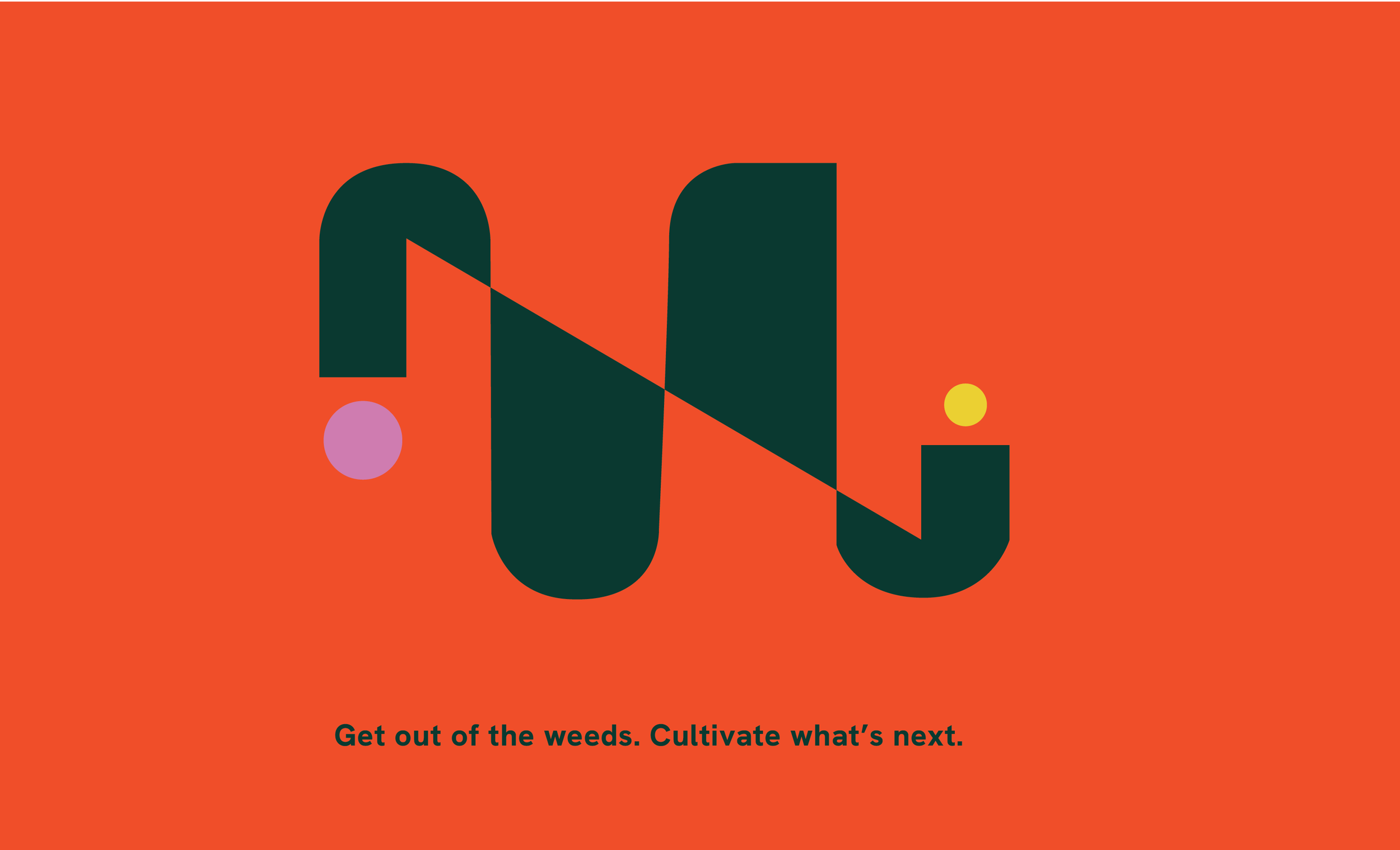
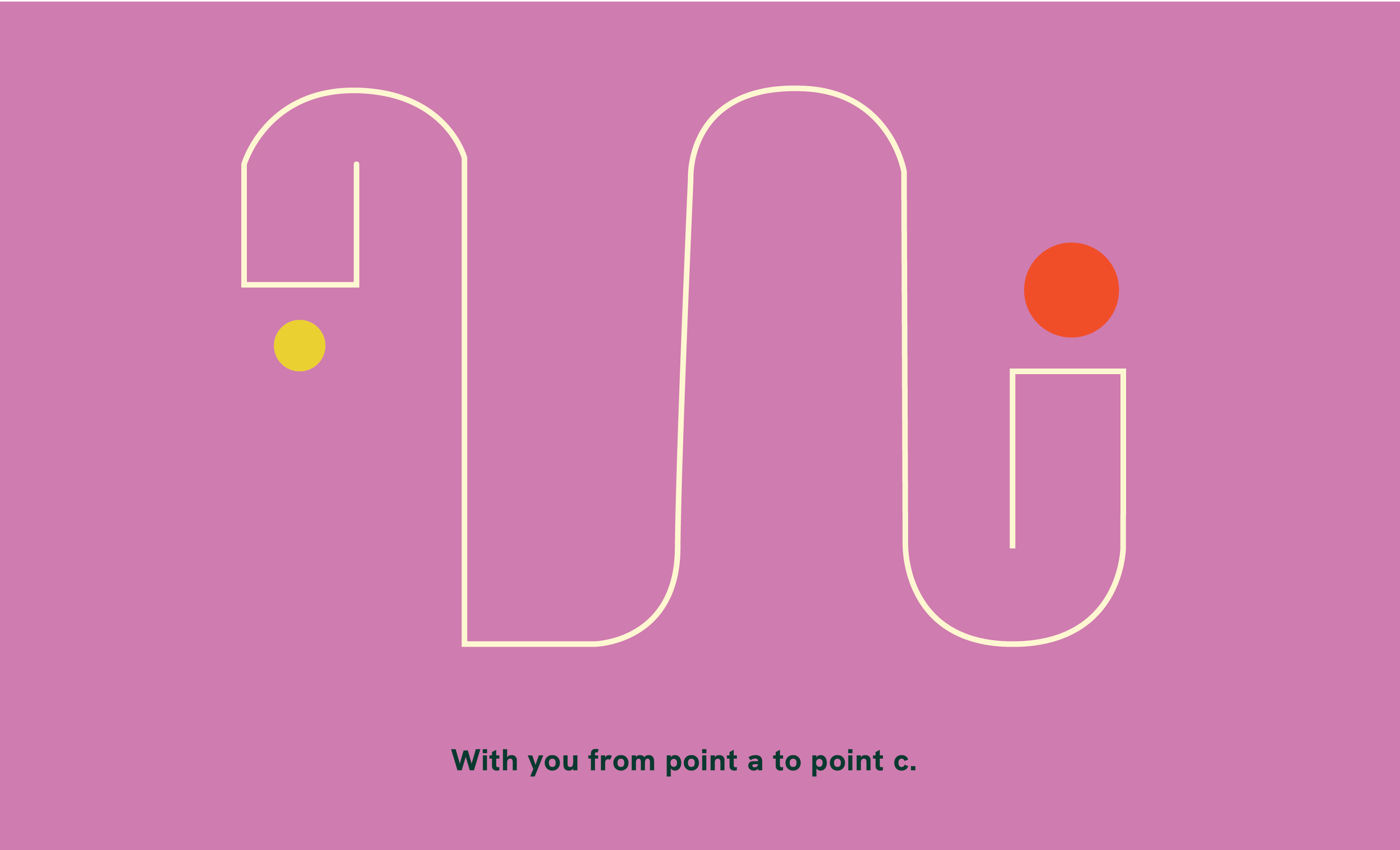
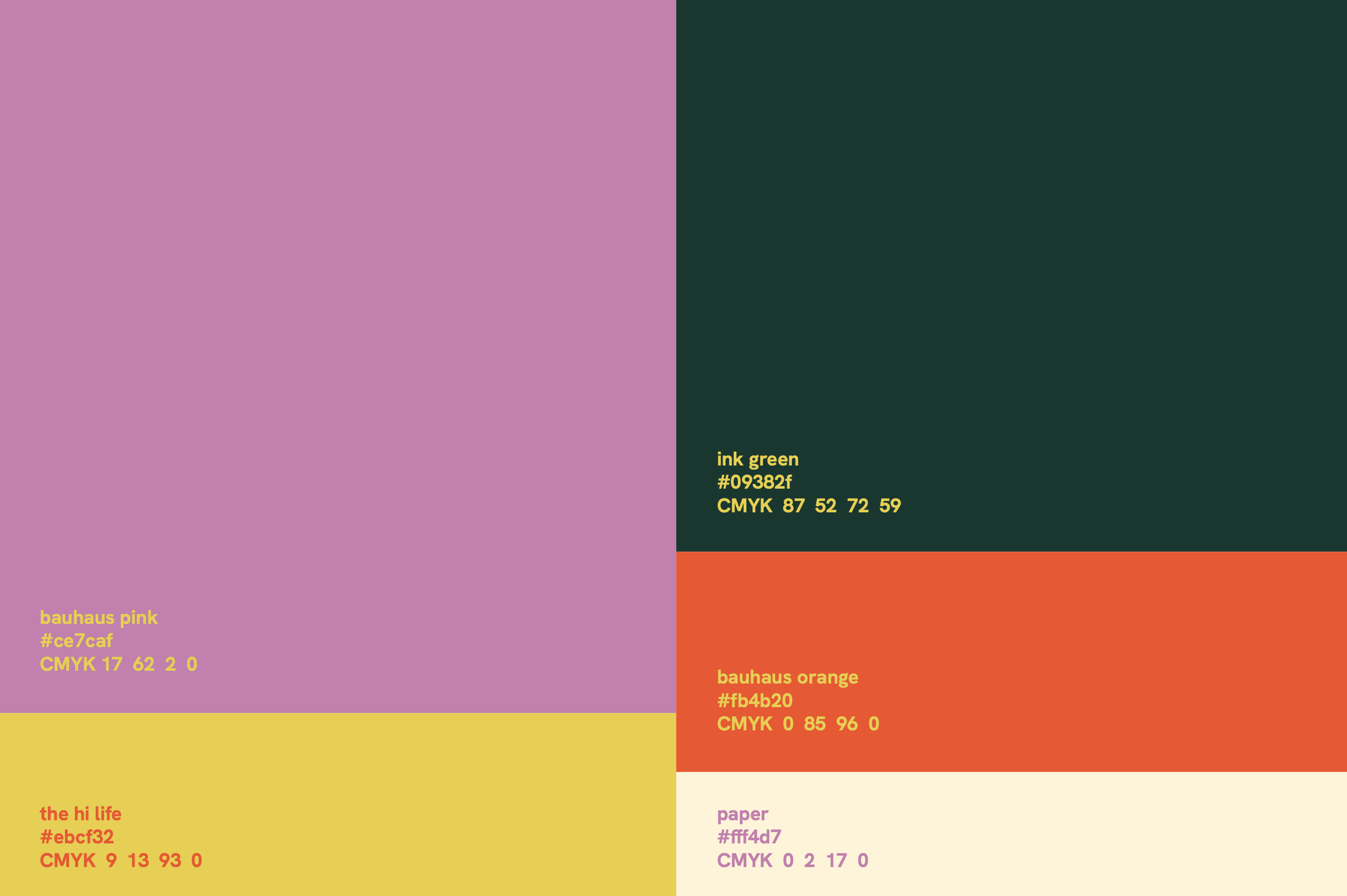
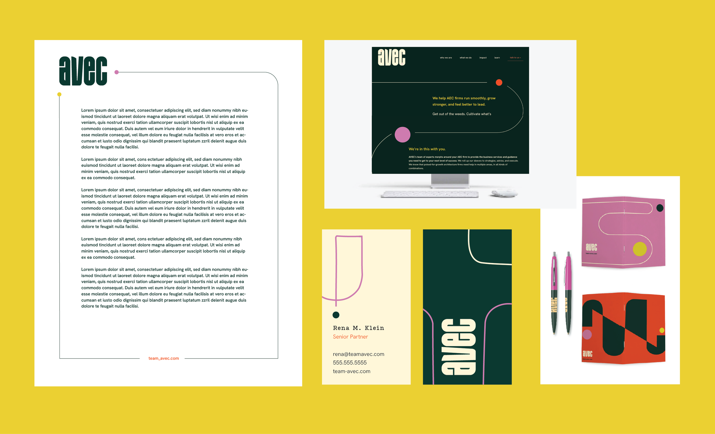
The visual system supports this tone—bold, refined, intentional. An unapologetically fun color palette lets us be us in all the right ways. The bold typography introduces rhythm and restraint, creating space for the brand’s personality to come through naturally.
The result is a brand that feels both elevated and deeply human.
Whole Systems Approach
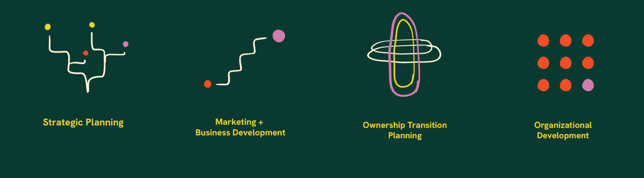
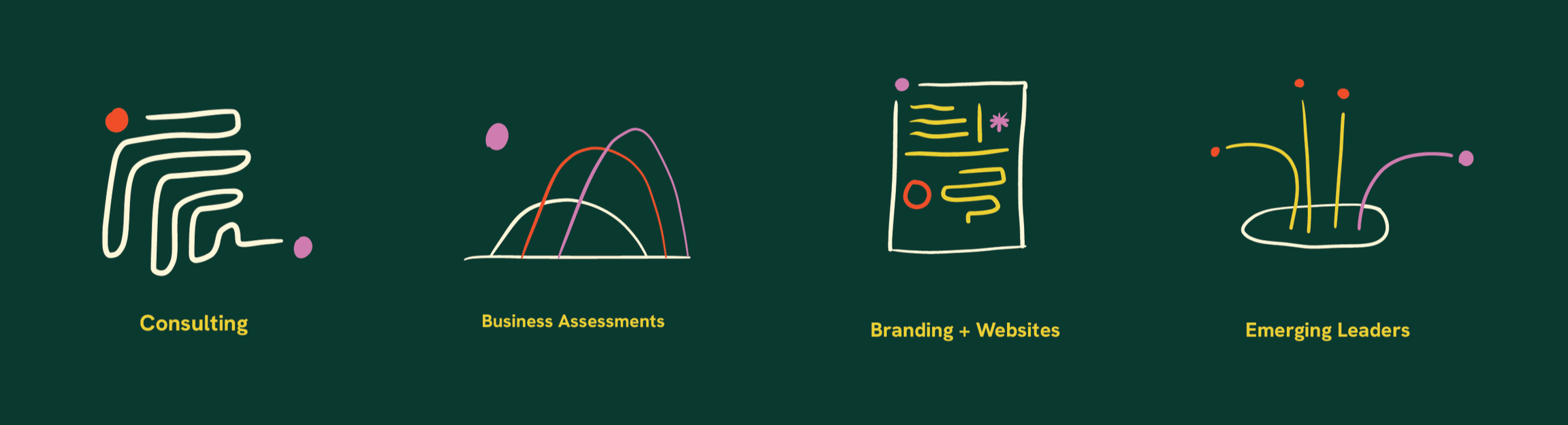
We meet clients where they are, and build custom solutions for each and every one. Our website prioritizes our highest and best use—firm partnership—but also shows off the range of specialized services we bring to the table. The “bloom” as we refer to it among our team, brings that message home.
We’re very proud of the (often astonishing) impact we bring to our partner firms, so we wanted to make that clear from the start. Then, as a virtual company, sharing opportunities to meet up IRL (or sure, in a webinar) was a priority, so we keep our calendar of appearances front and center.
The Impact
Within five months of launch, the numbers made the case: website sessions up 51%, total users up 79%, LinkedIn clicks up 61%, and Instagram views up 6,269%. Every primary engagement and visibility goal was met or exceeded.
Chat with us.
If you're thinking about a rebrand, a brand refresh, or just not sure where to start — let's have a conversation.