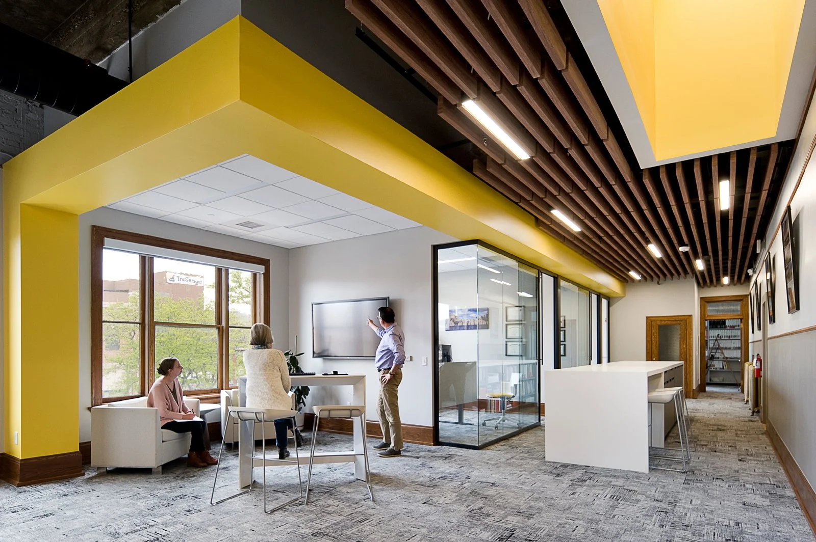
A legacy brand with deep roots in South Dakota was ready for an upgrade. To celebrate its 50th year, Architecture Incorporated’s new leadership team was ready to mark an impressive half-century in business with an updated, modernized look that better reflected the firm.
An Update, Not a Wholesale Change
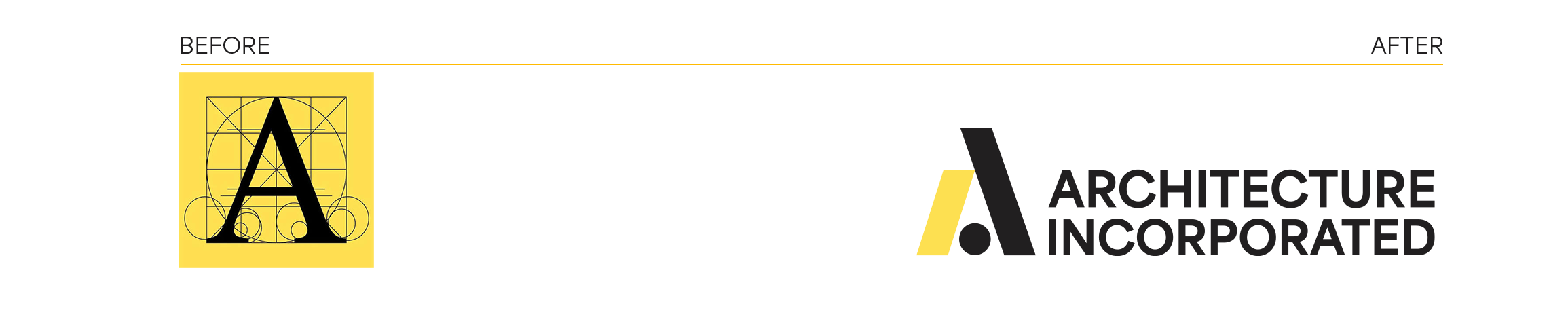
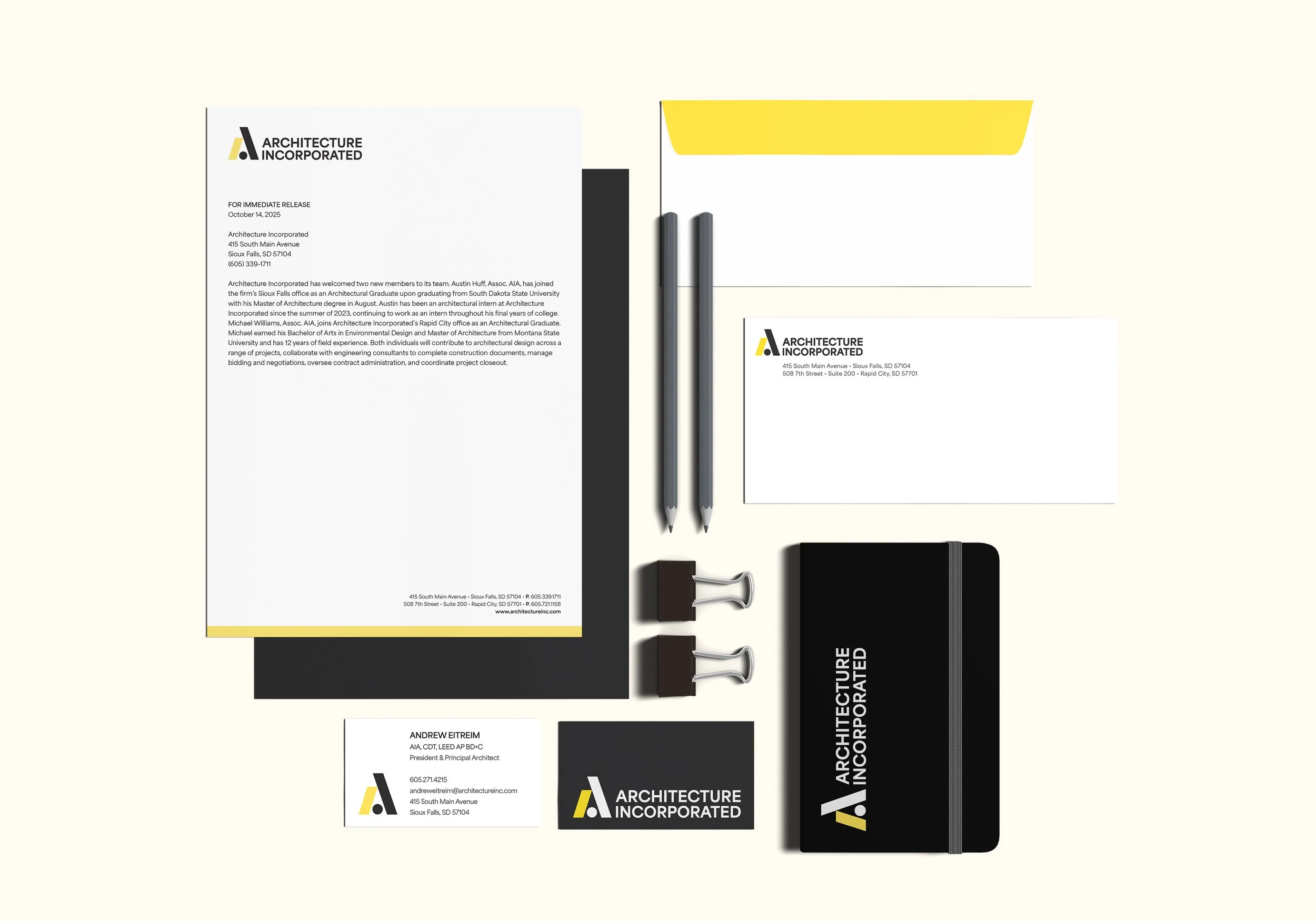
In updating the identity, keeping the letter A and the firm’s signature yellow and black were non-negotiables.
AVEC embraced the challenge by designing a logo that breaks down the A into three complementary shapes. Those shapes repeat themselves in a new website and updated collateral. A bright blue was added to the existing color palette to add a fresh pop of color. All of the elements come together with restraint—adding vibrancy without feeling overdone.
A Slight Repositioning
Client interviews, while overly favorable, uncovered a perception that the firm was being viewed as the “comfortable choice.” The firm was trusted, but they weren’t projecting their design sensibilities.
Web design.
A new website with intentional messaging tells a different story. This is a firm Rooted in the Midwest, designed for what’s next. A balance of creativity and practicality in the language, paired with bold pops of color and expansive project photos, ensures Architecture Incorporated shows up clearly as the firm it is today, and positions them perfectly for a bright future.