

After 22 years, Kelly Taylor Interior Design was ready to shift her brand from a solo act to better reflect her growing team. To accomplish the transition, Kelly turned to AVEC for a new name, brand identity, collateral, and website — all tied together with a more playful, little bit gritty brand voice.

It starts with personality.
Rocksalt's new brand feels a lot more like the people you actually want to spend two years renovating with.
Discovery included a deep dive into the firm's competitors and conversations with the team about who they really were—as people, as designers, and as a firm.

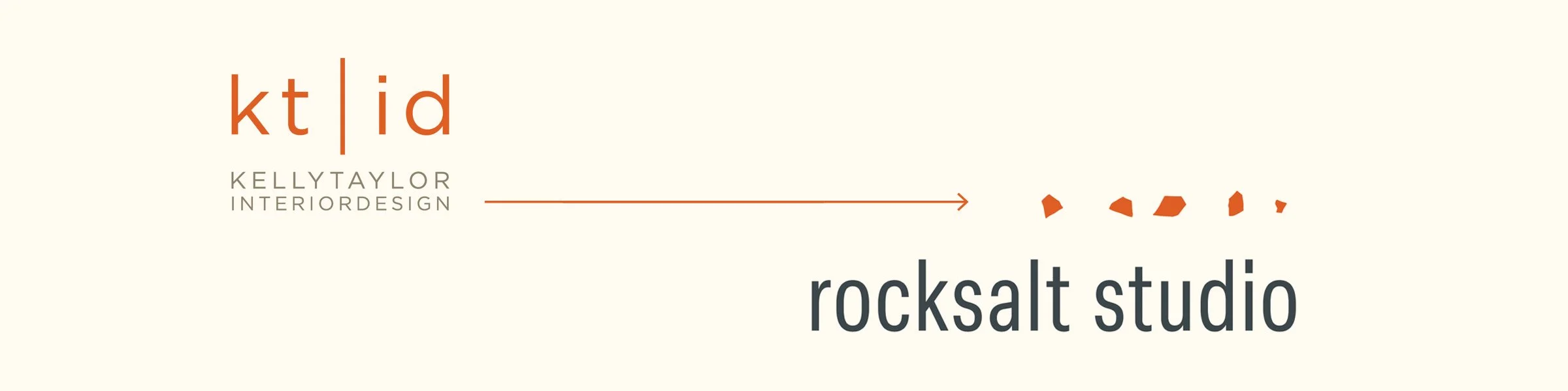
The name emerged from a desire to move beyond decorating language and toward something more architectural—competent, elegant, elemental, and a little irreverent.
Inspired by the dense mineral formed through the evaporation of ancient seas, the name evokes an urban yet coastal sensibility: solid, enduring, and sophisticated enough for high-net-worth clients who appreciate great design without taking themselves too seriously.
Cheeky.
With Restraint.
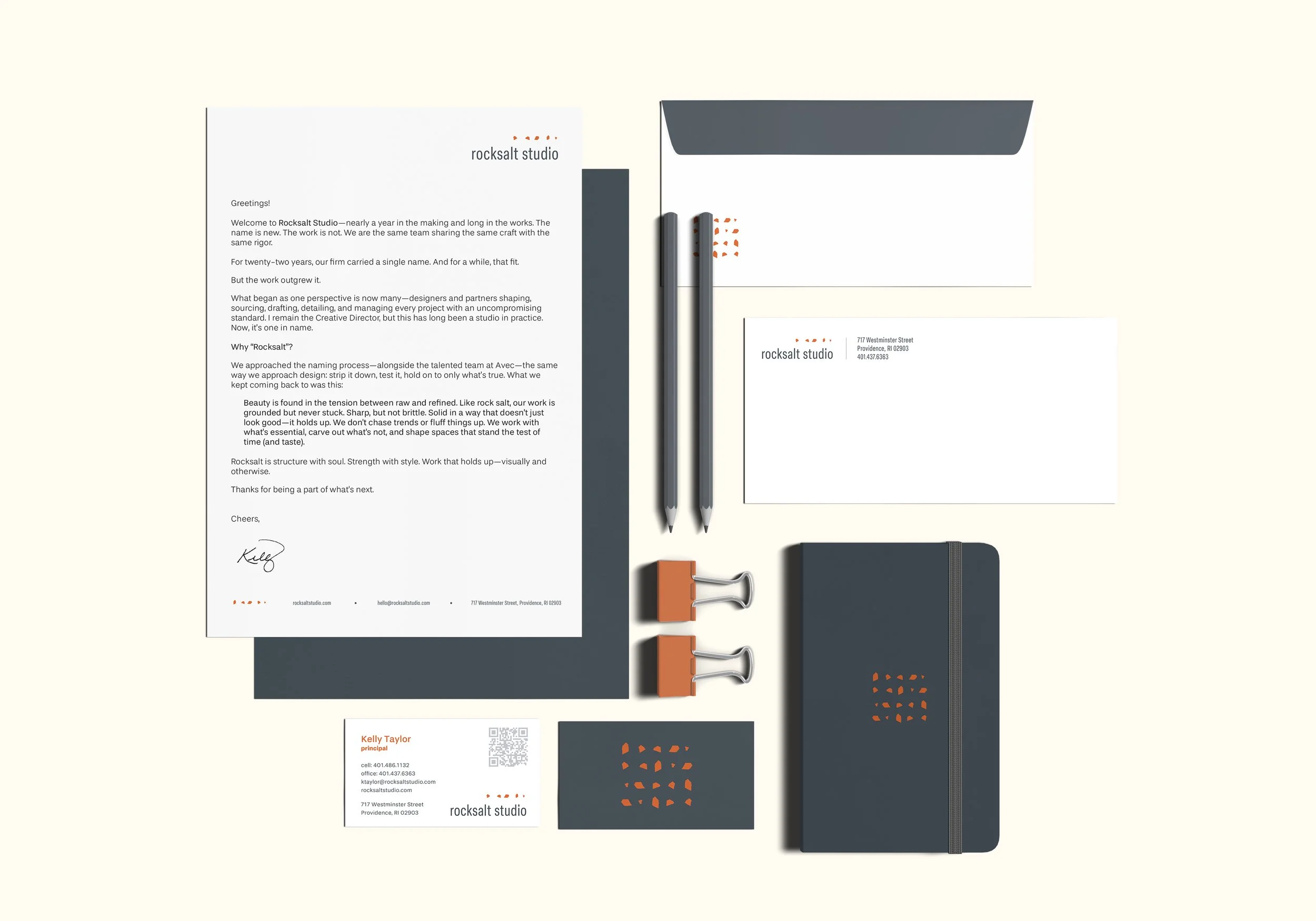
A new logo, brand identity package, and spot on messaging brings Rocksalt to life. The voice speaks directly and with confidence, while the logo and color palette ooze sophistication.

Luxury.
Without Pretense.
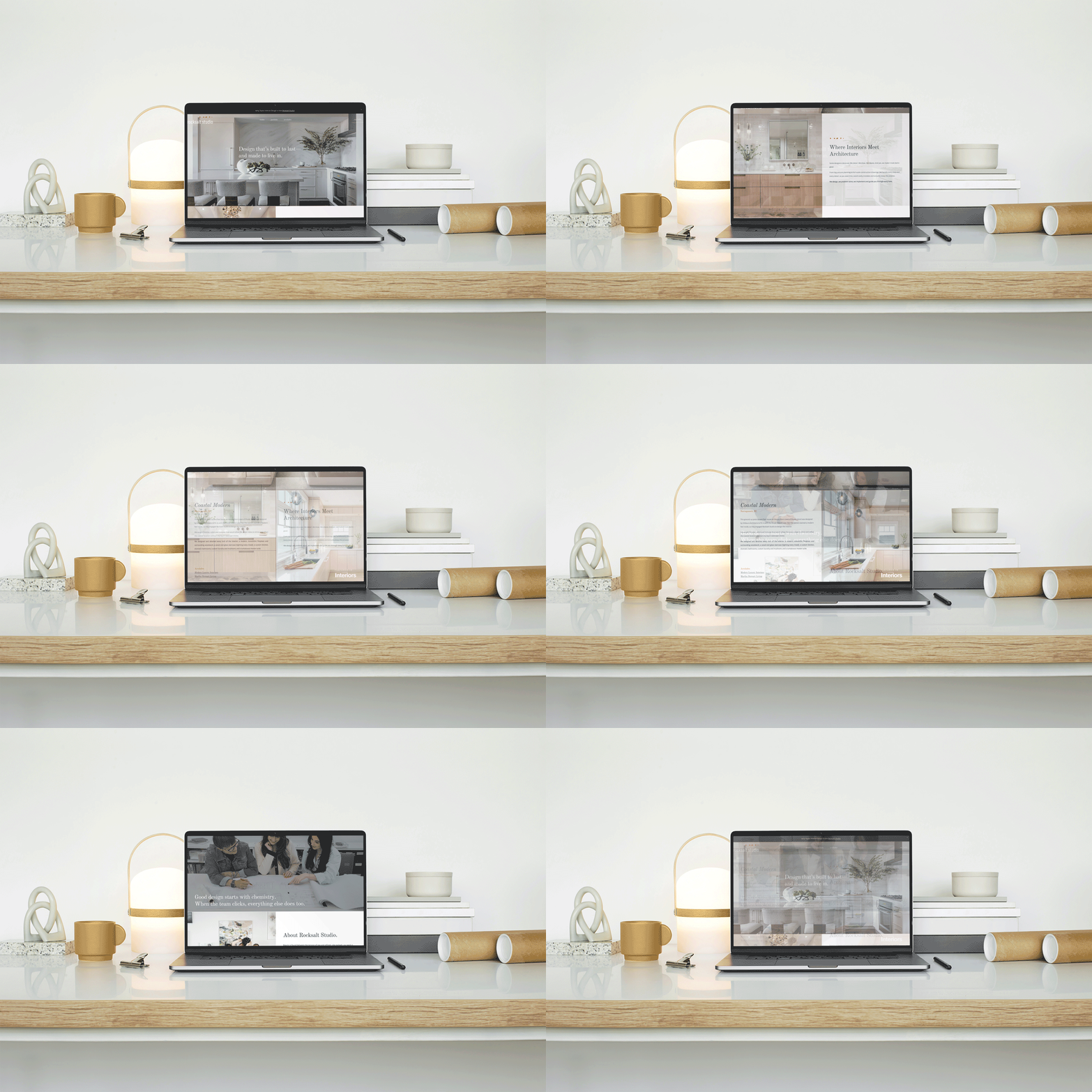
The website pushes the boundaries of irreverence to the proper degree. Large photos with paper thin margins anchor the site in the luxury interior design services category, while a sprinkling of rocksalt, text hierarchy, and bold copywriting push the playfulness.
Chat with us.
If you're thinking about a rebrand, a brand refresh, or just not sure where to start — let's have a conversation.